Saturday, 21 December 2013

images for double page spread


These are my images I will be using for my Good Vibes double page spread.
the lighting was very good and the camera timer was very efficient. We had some friends help set up a photography light which explains the random arm in one of the pictures. I took more than these, however, most of them didn't have us in and the camera kept falling over. My favourite position was with Ben on my back and I aim to include this as the main image to the double page spread.

Thursday, 19 December 2013


This is my final design for my contents page for Good Vibes. The colour scheme has been carried on from the front cover as planned as have the fonts. The image has been altered from a girl standing playing guitar to the guitar on its own. The image for the double page spread will be two males from the band Ocean Giants. The colours have worked well and would be a shame to put a stop to it so suddenly, so I continued to use this colour scheme on the contents page. Overall this contents page has gone well and the theme has flowed well from the front cover to the contents page. The double page spread will have the same fonts but maybe a few new colours will be added to liven up the magazine.

Thursday, 12 December 2013

contents for the music magazine


This is my contents page for Good Vibes, It is almost complete however there are some boxes that need rearranging and replacing in order for Good Vibes to look more professional. I have continued with the theme that started on the front cover and i feel it grabs the readers attention in the same way as it did on the cover. I may change the text under each headline in order to make it more legible for the reader.

Monday, 9 December 2013

Final design of the front cover


This is the final design of my front cover to Good Vibes. There have been many improvements made since my proposal such as the colour scheme, the fonts and the left third. However these improvements are ones that have successfully been placed to capture the attention of the reader who is interested in this genre. The cover of Good Vibes portrays a slightly heavier feel to the genre of music than first planned. For example, the colours are mainly black, blue and white which are sometimes used in metal and rock magazines (especially Black and White) on the other hand, they do capture the attention of the readers increasingly more than oranges and browns which have a tendency of blurring together.

Monday, 2 December 2013

draft 3 analysis


Third draft analysis

This is a third draft to the front cover of Good Vibes. It has had some changes in detail that I think will look better, however, there are still many changes that need to be made. For example, the left third needs to be allocated a font for the puff and a font for the plug which obeys the updated colour scheme chosen.
Below the left third, a cover-line has been placed as that is what I intended to add in the initial ideas presentation. The cover line is what I intended it to look like from planning the cover, the masthead is similar in the sense that the name is the same but I have yet to find a font which both suits the genre and grabs the readers attention. To conclude, a puff and plug needs to be added above the subjects head and the left third needs to be rearranged.

Thursday, 28 November 2013


This is the font that I will be including in the music magazine. It is also the title of the magazine which will be placed across the top of the cover; stretching from one side to the other. I have picked this font because it does not require any colour to look good, it is simple and easy, it works with the theme (its not too harsh and the lines flow fluently) as well as the genre.

another draft of front cover


Moving through the project, I have added some drafting text that will be placed in the left third. This will be the rough design of the left third. The font is not exactly what i had initially planned, however, it does bring out the blues of the subjects jacket and the guitar, once again, giving the cover depth.

Draft 1


As you can see, The masthead needs to be adjusted in order for it to capture the readers attention as well as lifting the text off of the page. There is room for a slightly chunky and detailed left third with an added coverline that will be placed across the subjects lower leg. The text will continue to be produced in white with a dark blue outline as that adds to the depth of the cover.

Wednesday, 27 November 2013

front cover and contents shots for Good Vibes


The images above are the shots i took for the front cover and contents page of Good Vibes. I made sure to include enough room for the left third as well as the masthead, cover line, puff and plug and other small features such as the bar code and price. For the contents page, I made sure to give enough space around the guitar for the contents column and the title of the page. The clothing of the model has been purposefully created to match the colour scheme of Good Vibes; it is another small factor which makes the magazine look increasingly professional.
The location of the shots were also planned with great care; the woodland being a representation of the calm, Indie side to the genre and the electric-acoustic being the Rock aspect. The images were relatively difficult to capture as the sun was setting which means we had little natural light, also it was hard to pick a day where it hadn't been raining. It was also difficult to capture a picture where my shadow wasn't present, as you can see in the examples above, my shadow creates a huge draw back when capturing the image.

Overall, the images taken for the cover and contents of Good Vibes are meant to promote the Indie ideology to Indie-Rock and let it be a factor which enables the magazine to stand out from the conventional shots of celebrities up close. The images were a great difficulty to take, however, they will be of great use in making Good Vibes.

music magazine proposal

music magazine proposal

Good Vibes will initially be aimed at an audience who are of the age between 15-25 years old, I have chosen this age gap because some of the language and content that will be included will be constructed to give an impact on the lives of that age range in particular. The front cover of Good Vibes will include a brunette teenage girl playing the guitar under a tree in a field, or it may consist of a guitar lent against a tree with a ghostly figure of the girl which has been layered over the original photograph. I plan to use this back drop and person as the genre is indie which is generally associated with calm, yet quirky images and sounds. This is what the younger generation has taken a particular interest in and i believe that using these ideas as front covers will attract the readers attention. I plan to use a normal camera to capture the shots. 

The genre of Good Vibes is going to be Indie. This is a very popular genre of music particularly because of its quirky and calm vibe which is particularly popular within the age range that i am aiming the magazine at. I know this because I am from a group of people that take an interest in listening and creating this genre of music. The type of genre that the magazine will focus on will give the reader a good estimate on the content that the magazine will  contain. It will contain articles on bands and artists: strange facts that you didn't know about them, most embarrassing moments and any news for them. There will be one main interview that will be across a double page spread and will include, how the group or artist started or formed, any news, past performances  hobbies and interests. There will also be a 'download of the month' section where readers will be able to find four downloadable songs that they can put on their phones, i pods or laptops. There is four songs because this means that there will be one every week for readers to download; meaning that they will have to keep hold of the magazine instead of throwing it away which, i think, will serve as a benefiting factor that most other music magazines have; even if they do, they may only have one or two free songs to download. There will also be a list of great gigs to go to that are of an indie/folk genre. For example, Good Vibes will contain a list of bands playing from that day up until the next month. The gigs to go to will also include ticket prices and reviews.

A cover-line that Good Vibes will include is: 'read all about upcoming band Ocean Giants; their interests, hobbies, and how they started as a band!'
The title that i have decided on is Good Vibes. This is because the magazine will be a very optimistic magazine in terms of music and i feel that the magazine its self will give off a 'Good Vibe.' The title is also simple and easy to remember. The font for the title is from dafont.com and well suits the genre and contents of the magazine. There are no harsh colours or shapes that would normally be compared to a heaver genre of music. The magazine will be published April next year as everyone will just be finishing school and college and will be having lots of time off to read and relax as most students will just be finishing exams.

Good Vibes will be published monthly as the magazine will include up coming gigs; if the magazine were to be published weekly then the 'upcoming gigs' section will be identical most weeks. On the contents page, it will include a picture of an object, scenery or both in one image. I'm very keen in promoting the idea of an image as the background for the contents page simply because I think that it will look professional, attract the attention of the reader more than if the background were to be a solid colour and finally because I feel that it will liven up the magazine on a whole; giving it more character and just generally going with the theme. I'm planning the contents page to fit with the colour scheme that is placed on the cover as i believe this will look more professional to readers. 

Good Vibes will be sold at £2.00; this is because the magazine will be a little shorter in terms of pages, however that doesn't affect the information that the magazine will contain. Good Vibes will still hold valid, interesting and enticing news and information about indie music and its artists, it will just be condensed into a maximum of 45 pages. This is so that the magazine will be a cheap dose of information that indie readers will be able to pick up and read.  

Monday, 25 November 2013

Double page spread initial ideas


contents page initial ideas


flat plan for contents page


flat plan for my double-page spread


Flat plan for front cover


This flat plan for the front cover of Good Vibes is the base I'm going to design the magazine around. Although this is a basic design, it is easy to follow and it gives me freedom to create a unique front cover that reflects the product and audience. The main image is going to cover the whole front cover, however the box represents the female who is going to be positioned there. The left third is going to be one big block down one side rather than it being spread out across the magazine. Finally, the masthead is going to be bold but reflect the Indie-Rock genre.

planning for the music magazine 

the plan for my music magazine is demonstrated on powerpoint which includes the planning for fonts, photo/main image, coverlines, genre, masthead, colours, supplementary-photos photos, price and design.


Wednesday, 20 November 2013

double page spread comparison research


double page spread comparison research


This double page spread is largely different from the one I intend to produce, however there are some key features that I will be including in the double page spread of Good Vibes. 
For example, there is a pull quote  which obeys the colour scheme and stands out to catch the readers attention. This is what I intend to do in Good Vibes double page spread. 
There is also a main image accompanied by smaller thumbnail images below and to the right. For Good Vibes, there will be a main image to the right at the top almost covering the whole page with a sidebar with other shots of Ocean Giants. 
The is little writing in this dps, then again, it is a rock magazine and isn't a literature based one.


This is a slightly different genre of dps, The vaccines are a lighter genre which can be seen though the photography and the layout of the page. 
The image of the band itself is lighter compared to the rock image which is darker and more heavy.
The clothing of the band contributes heavily to the aura of the photo as they are all wearing light, matching clothes whereas the other dps has black leather and a darker feel to it. 
The dps I will be including in Good Vibes will be even lighter to this one, as the magazine is a indie rock genre, the image will be brighter. Also the colour scheme is similar to the one I intend to produce in Good Vibes; there will be blue and white in the Ocean Giants interview as there is in the Vaccines dps.

Music magazine front cover analysis and research

This example of music magazine comes from NME has contains  heavy rock band Nirvana on the cover. 

The masthead in the cover contains the main colour in the colour scheme to enable it to stand out. It is positioned to the left, this means, when they are displayed in a fan shape, the masthead will stick out. This makes the masthead easily readable. There is also a puff and plug located in the top right hand corner; the puff being 'WIN' and the plug being the information that comes with the attractive word or shape, in this case it is information on winning limited edition band artwork and the page number it is on. puffs and plugs can be placed almost anywhere on the front page of the magazine, multiple puffs and plugs can be used at once. The font is the main indicator to its audience as it is scrappy and scrawly handwriting. The rough outline of the font also represents it genre, being rough and rigid. 

The main feature of this example is the cover line which stretches across the whole front cover.This, i think is almost as eye-catching as the masthead; it is bigger bolder and contains the yellow colour scheme which stands out an increasing amount with the grey background shade. this colour scheme compliments the heavy rock genre of the music magazine well, it also is the colour scheme for the bands iconic logo:


Music magazine front cover analysis and research


 conventions from magazines such as NME, Guitar and Q  are some examples of music magazine which i will be analysing in order to identify conventions of traditional music magazines and what conventions represent different ideologies within the music industry.


From analysing the above image of 'guitar' magazine, it is clear to see that the image of the female is representing a light rock/rock genre. this is because of the make up defining the eyes and Gothic cross necklace combines with the swirly guitar skin and blonde, styled hair. It is unusual to see a woman representing such a genre as this, giving the magazine an individual specialty.

The left third of the front cover is slightly heavy in terms of wording; giving the reader information on the magazine articles in various fonts and sizes to portray the style and music genre. this factor also includes the colour and positioning of the left third; overlapping the main image of the female in black. This creates a 'shouting affect', the text is almost in the readers face, the main article is is front of everything, overlapping the centre image. The let third column is to give the readers a brief view o examples o articles within the magazine, highlighting the most popular articles

The masthead is colour coordinated with the colour scheme of red and white, the title is bold, and holds a font which aboeys the genre; the small flicks on the edges of each letter portray a 'rock' feel. The masthead is to determine the title of the magazine; containing a font, colour and name which matches the colour, genre and stands out to the reader


As you can see from the image above, the contents page is extracted from NME music magazine. There are a number of features which work together in order to determine the target audience, a typical reader of NME and what age group the reader is. Firstly, much like other contents pages, there is a main image which is usually of the main band/artist that the magazine is based on due to its cover line and left third. Within the image, the band is wearing mostly black, with a black background and playing electric guitars. this is setting the genre of music and giving the readers  a subtle insight as to what the magazine will contain. 

The colour scheme of the contents page brightens up the heavier impression given within the top half of the page. The bottom half is based mainly on red and white. This combination of colours don't reinforce and particular category of music; they are neutral colours. This leads to the point that the band the magazine is based on is in between rock and lighter rock, meaning a wider range of target audience will be able to relate and enjoy the magazine. Also, the band arctic monkeys (the band within the image) is a light rock, rock band which are in between the two genres. 

The layout of the contents page also reinforces the point stated above of the genre presented by arctic monkeys being in between rock and light rock. The fact that the page is almost split in half with the darker colour at the top and the lighter ones at the bottom. The top banner is a bulky black title of the contents page whereas the bottom contains text on a white background which adds the lighter side to their genre. Although the layout of the page is not 100% split in an exact half, the diverse colours presented suggests the middle genre of rock and light rock.


The contents page above is extracted from Kerrang music magazine, the page consists of a main image within the top half and the contents and articles within the bottom half. The main image is of a famous guitarist who was in a famous rock band. This suggests that the audience of this magazine will be into rock and even heavy rock, this is because, as well as the main image of a rock guitarist, the colour scheme is mainly black white and yellow. These colours, especially black and yellow, is associated with heavy music genres.

The font of the contents page also reinforces the idea of heavy rock, this is because within the black band dividing the two halves of the page, the text is scruffy and rigid. This gives the idea of heavy, rough rock which is uneven and rebellious. The text within the bottom half of the contents page is neater, yet the headlines for the articles arein black boxes, making the article titles stand out which adds to the bold, rebellious vibe the magazine is portraying.

The clothing and dress of the artists in the images are almost all black, this is another factor which reinforces the ongoing theme of heavy music genres. Because the colour the artists are wearing only compliments the genre, it leaves a wider age group to enjoy the magazine. What i mean by this is the colour scheme, text, and clothing all represent the genre more than the age group, the only factor which is obviously representing the age group is the font of the text. All the other features enable older and younger readers to understand and enjoy the music magazine.

By doing this, Kerrang is able to sell to a wider range of readers meaning an increasing chance of gaining income to the magazine and the business.

music magazine contents page analysis


As you can see from the contents page extracted from 'Q' music magazine, the typical reader will be slightly older than one of 'KERANG' or 'NME'. This is because a number or reasons to do with layout, colour scheme and photography. 

Firstly, the layout is slightly similar to that of a front page; the left third down the left hand side, the masthead located at the top. However the main image is split in two. There is a review section located in the lower half of the two and the upper half contains a main image which displays the main article of the music magazine. This will catch the readers eye immediately and the main image will be the first thing they look at. 

The colour scheme of the contents page is similar to some music magazines but parts its self from the main rock and heavy rock magazines. This is because the red banners and numbering give the magazine a sense of class and even a little age. This, in some ways boosts the age of the target audience readership slightly. It is the combination or red and white which do this most, as white is kept as a main colour in the colour scheme.

The photography is mainly of male gender as males are generally the representation of light rock which is what this music magazine suggests the readership is. As well as being males, they are dressed in black clothing to represent the rock side of their genre, also they are all stood on a hill in the countryside to show the light side to the music they produce.

contents page analysis


This is a contents page extracted from 'KERANG'. There are main images that represent the key articles and stories which are the most important and popular to attract the attention of readers that the music magazine is aimed at. The a typical member of audience for this magazine will love rock, go to gigs and have some sort of rebellious attitude towards life. Although this may be a very stereotypical overcast of the reader audience of this magazine, the majority will have at least one characteristic that is stated above.

The contents page its self also demonstrates these characteristics through a number of features. One example is the colours scheme. The main colours to this contents page are black and yellow. These colours can be easily associated with industrial equipment and heavy machinery; especially with the boxes of black and yellow located on the right hand side. This association with heavy industrial equipment and machinery compliments the idea and projects the genre of heavy rock. The bold font also shows this.

The layout of the 'KERANG' contents page gives out a rough rock vibe; the left hand side reinforces this idea with the mess that looks like paint spatter. Also, some of the images are different sizes and the industrially coloured numbers look as if they were cut out of a magazine. This adds to the scruffy, rock look that the magazine is trying to project to its target audience.

The photography of the artists performing also co-insides with the theme stated above; the men have tattoos and there are quirky costumes and rock guitars. If the images were of middle aged men displaying their rolls Royce then the whole idea of the magazine would collapse, the producers need to keep everything to theme to cooperate ideas together to project their target audience type.


Music magazine front cover analysis and research


The above music magazine cover is Kerrang displaying Biffy Clyro as the main article and artist. From looking at the main image, the music magazine is aimed at teens who are into rock. This particular artist specialises in christian rock and composes most songs on christian beliefs. This indicates that there is a specific audience who the band is aimed at. Obviously, lots of non-religious people listen to the band. The main image adds to the teen audience idea because the lead singer is topless shouting, this doe not compliment the older age group of 40+ because at that age, society becomes mature and sees young things as immature and disrespectful. the younger tagerget audience will aspire to this as they are in thier wild, young years where they go to parties, get drunk and listen to music. The main image of Biffy Clyro represents this.

The left third feature of the any magazine is to identify the main articles, features and even ocasional free items which are given out within particular issues. In this instance, the issue is handing out 10 signed posters. This is a big give away and will attract many readers who follow the band and similar artists to enable them to collect the freebie.

The coverline is perhaps one of the first things readers will look at, this is because is it the main size as the masthead and is it in yellow text, meaning that is stands out more with the blue background. Coverlines as used to display main artists and bands that the magazine is based around, in this case, Kerrang magazine is focusing on Biffy Clyro and an interview with them.

The colour scheme of the magazine containes may bright colour such as blue, and yellow to represent youth and young readers, older readers would be represented with perhaps purple, dark blue and brown. The colour scheme is imaprtant to the magazine as is can reflect who it is aimed at; in this case under 40's.

Music magazine front cover analysis and research


the front cover displayed above presents Jay-Z in a zoomed in caption with a series of conventional magazine features surrounding him. The main image is almost always the primary artist that the magazine is focusing on within the issue. The caption also represents the artists genre of music; with rap and hip-hop being lound, 'in your face' music, the image of the rapper is literaly 'in your face'. This refelcts not only the genre the artist performs but also the attitude behind the genre and what category of audience will be listening to the music.

The masthead is contained within the top left hand corner of the magazine and is perhaps the second thin the readers set their eyes upon, the main image being the first. The masthead is the title and base of the magazine, all other coventions of the cover is based around the masthead. The masthead also sets the colour scheme, this is because the masthead is one of the first things that readers will look at when reading the magazine. In this instance, the masthead sets the colour scheme of red and white. This is carried out through the rest of the cover, the left third is white, the background is white and the majority of the texts is white and red. This is a colour scheme that is carried out through the whole company of Q magazines.

The left third is cleaverly divised, as the main image is so up close, the left third has to be based around a smaller area. This means only including relevant information such as main articles and trimming the extra wording down to the essentials. This reduces the 'busyness' on the cover, making it look more professional.

Friday, 1 November 2013

The music magazine project


Over the next few months until April, I will be researching for, planning, constructing and evaluating a music magazine front cover, contents page and double page spread that has specialises on Indie-Rock and has specific target audience and age group. The music magazine is called Good Vibes and will contain Indie-Rock bands, interviews and gig galleries.

Thursday, 24 October 2013

Conclusion to student magazine task

In conclusion, I found the program I was using fairly easy to adjust to. However, I had never used the application before so I felt that i had a little disadvantage to everyone else. On the other hand, I managed to produce a satisfactory amount of work that I have spent a long time on. I particularly like the centre images that were included as they projected the idea of a student's life. However, the colours in the images were hard to put a colour scheme to. Thankfully the college logo colours go well with the image and I am overall proud of what i have produced. 


These were the photos that I was going to use as pictures for the front cover and contents page. Some of the photos were too blurry and some were not the right shape I was looking for. Thankfully, I have two that fit my needs and have used for my assignment.

Student Magazine contents page

The contents page went very well as i had enough room to include the articles i was planning to include as well as the page number, a free meal voucher code and an introductory segment to let the reader know what the magazine will be about. 
The colour scheme is the same as it will be a running theme that will run throughout the issue. 
Again, I have tried to highlight the key words in each article title to let the reader know what it will be about; this will also comply with the colour scheme. 
The centre image is another student, who is suggesting to the reader that there is a definite balance between the social life and educational life of a typical student. 


As you can see, the text is small, yet the layout is traditional in terms of a typical magazine contents page

Monday, 21 October 2013

Media student cover magazine


Magazine cover

This is my magazine cover that I will be using for the task. I have yet to create a contents page, however I have some pending ideas that I will soon apply to the magazine.
As you can see, I have used the colours of the Southdowns logo; this will make it look better than if I use random colours; it will give the magazine an organised feel to it.
The mast head is simple yet effective, it tells the audience what the magazine is about with one simple word; the readers will be able to predict what the magazine will be about just from reading the masthead.
The highlighted puffs are green to catch the readers eye as well as go with the colour scheme of the college.

Thursday, 17 October 2013


Flat plan layout 


This is my flat plan layout; it is the basic design of the magazine I'm going to create called 'Student Life.' As you can see, this is the traditional layout for magazines that are made today, there is the masthead located towards the top of the page, the article titles in the left third, and the centre image. For my magazine, I'm preventing to include the many 'plugs' and 'puffs' that you would see on a typical magazine today. I'm also going add a segment of an article that will be included in the contents of the magazine which I have yet to write. 

Wednesday, 16 October 2013


Initial Ideas for Preliminary Task:

My magazine will be aimed at college students and their experiences inside and out of college. The first  idea of the student magazine will be the topics it covers to include in the contents page. The magazine will be aimed at students but I'm determined it to be not all about work and study; more the social events and gigs that our age range will benefit from. The title of my magazine will be 'Student Life'. This title appeals to me most as I will be aiming to cover the social life of a typical student as well as adding some course tips.

For my background image, I'm planning to include a picture of me in mid air jumping off of some stairs. This image combining my given body language will give off the impression of college being an exciting place to do your course. It will look appealing to fellow students as it will show students that you can achieve the correct balance between social life and study.

I am also thinking of placing the masthead in the traditional place, just above my head so it doesn't get cut out. Also, the colour scheme will be red, and white. This will apply for the cover as well. 
the left third will contain a smart column of articles the magazine will contain. Including 'keeping on top of work' and 'Social events to attend.' The font type will be Ariel to give it a smart/casual feel. I don't intend to add too many puff and plugs as they seem annoying to the reader. Although I may include one or two about competitions to win tickets to gigs or to win an i phone.

The contents page will include the same background image that is displayed on the cover, however, it will be taken from behind. This will give the magazine a 360 degree view of the image, moreover, it will be adding m a personal touch that is important to the magazine. I aim to create the expected magazine for the task but add a 'quirky' feel to it.


Monday, 14 October 2013


I created this cover when drafting in ID.
I have yet to add a masthead a various other additional text, however i have managed to fit the selected image to the cover frame with no excess image left over.

Friday, 11 October 2013

IPC media case study task 5


IPC Media case study task 5

IPC media is an award winning digital publisher and consumer magazine founded in 1958. It holds 60 iconic media brands and is accessible by phone, tablet and on-line. IPC media has a huge audience of 25 million global users every month. The company has an associated partnership with its advertisers, business partners, employees and consumers. IPC has a huge variety of magazines that fall into the categories of: men, women, home, lifestyle, up market women's lifestyle and TV. These categories get sorted into five division groups: 

IPC connect 
IPC connect is the mass market women's division. It holds a wide variety of magazines which are read by 9.4 million mass market women. The digital brands are used by over 5.3 million unique users. It is obvious that IPC connect serves millions of women which rely on the company to deliver the media efficiently. The audience is highly responsive as so many women read and use it; making them valuable to IPC connect. Here are the magazines associated to IPC connect: 


Teen Now
Woman
Woman's Own
goodtoknow Recipes
Woman's Weekly
Pick Me Up!
Chat
Chat - It's Fate
Chat Passion
NOW
What's On TV
Soaplife
TV & Satellite Week
TV easy
TVTimes


IPC southbank
IPC southbank is the upmarket women's division. It has 3 specific groups that it focuses on which include fashion, women's lifestyle and home interest. This category is for the target audience of a middle aged, middle class women who have time and money to spend on these particular magazines. Its readership base reaches up to over 10 million. Here are some examples of IPC southbank magazines:


Marie Claire
InStyle
Look
Woman & Home
Feel Good Food
Feel Good Home
Essentials
Ideal Home
Homes & Gardens
Livingetc
Country Homes & Interiors
25 Beautiful Homes
Beautiful Kitchens
Style at Home
Wallpaper

http://en.wikipedia.org/wiki/IPC_Media#Southbank


IPC inspire

IPC inspire covers a lot of categories that are all inspiring activities for men. these include: country, shooting, equestrian, marine, sport, men's lifestyle, music, cycling, decanter and technology. These are a lot of categories to cover as the portfolio contains 38 cover brands. This category contains everything from 'country life' and The Field' to 'Nuts' and 'NME'. These are the magazine covers associated with IPC inspire: 
Country Life
The Field
Shooting Times
Shooting Gazette
Sporting Gun
Horse & Hound
HORSE
Eventing
International Boat 
Industry (IBI)
Practical Boat Owner
Yachting Monthly
Yachting World
SuperYacht Business
Motor Boat & Yachting
Motor Boats Monthly
Rugby World
World Soccer
Golf Monthly
Nuts
NME
Uncut
Mountain Bike Rider
Decanter
http://en.wikipedia.org/wiki/IPCMediaInspire


                                                                             History of IPC 


The 1950's was a competitive era as there were so many big publishing companies were dominating the media. there were three leading publishers in particular who were in competition. These were: George Newnes, Odhams Press and Fleetway Publications. 

These three businesses teamed up with the mirror group to found the International Publishing Corporation. These three magazine publishers had been established in 1881, 1890 and 1880 so they had their own impressive history to work with. They had magazines that were being published in the late 19th century, however they were all under the umbrella of IPC. 

IPC has been through 150 years of amazing history that contains many highs and lows but always survives. It is now the leading magazine company which owns the most popular magazine titles. Such as 'What's on TV?' 'Nuts' and 'NME'. 


Questions/History continued 


IPC has now gained every target audience as it owns almost all of the major magazine titles. When the corporation began, in the 1800s, the company was mainly focused on the general public, middle-working class. The company released a successful article during the Crimean war which was important as communication was weak in those times. Any information about the war that was received was crucial, it was a serious time and the article contained narrations of the soldiers who took part in Charge Of The Light Brigade. However, there were some recreational titles to keep the British spirits high: 'Country life' 'Yachting world and 'Amateur gardening' were popular British titles. These magazines were aimed at the middle class who had money to spend on magazines. 

Now days, the company has grown into a huge corporation which includes titles of all categories. As Britain is not in any life threatening position such as that of the Crimean war, the company is able to thrive on the modern day technology and resources. 3 years ago, IPC had to categorise the many magazines they owned and managed. This was a big step forward for the corporation as they were now growing at a considerable rate. These categories were: Men, Mass-market women and Up-market women. As you can probably predict, these categories will be associated to the magazines that the category would conventionally read. For example the Up-market woman would read 'Country Homes & Interiors.'

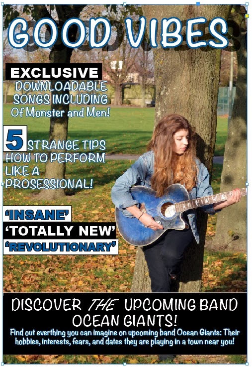
IPC would be great with publishing a new music magazine as they as a category which holds only two big titles. NME and Uncut are both two huge music magazines which reach over one million readers per week. Although people can get the information slightly faster on-line, the physicality of the magazine is what sells. There is a lot of genres to create a magazine on (rock and pop being the most popular) so it is important to impress the consumers on a weekly basis, if so, then it would be a safe move.  

With Pop and Rock being the most popular genres of magazine, it would be likely that IPC would publish a music magazine of those genres. Although, they are a large corporation, therefore can afford to take risks such as this. It could be time for a famous Folk genre magazine. IPC may add a little safety by creating a Folk-Rock magazine to keep the interest of the consumer.