Saturday, 21 December 2013

images for double page spread


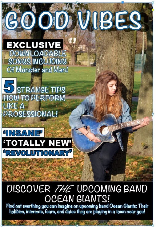
These are my images I will be using for my Good Vibes double page spread.
the lighting was very good and the camera timer was very efficient. We had some friends help set up a photography light which explains the random arm in one of the pictures. I took more than these, however, most of them didn't have us in and the camera kept falling over. My favourite position was with Ben on my back and I aim to include this as the main image to the double page spread.

Thursday, 19 December 2013


This is my final design for my contents page for Good Vibes. The colour scheme has been carried on from the front cover as planned as have the fonts. The image has been altered from a girl standing playing guitar to the guitar on its own. The image for the double page spread will be two males from the band Ocean Giants. The colours have worked well and would be a shame to put a stop to it so suddenly, so I continued to use this colour scheme on the contents page. Overall this contents page has gone well and the theme has flowed well from the front cover to the contents page. The double page spread will have the same fonts but maybe a few new colours will be added to liven up the magazine.

Thursday, 12 December 2013

contents for the music magazine


This is my contents page for Good Vibes, It is almost complete however there are some boxes that need rearranging and replacing in order for Good Vibes to look more professional. I have continued with the theme that started on the front cover and i feel it grabs the readers attention in the same way as it did on the cover. I may change the text under each headline in order to make it more legible for the reader.

Monday, 9 December 2013

Final design of the front cover


This is the final design of my front cover to Good Vibes. There have been many improvements made since my proposal such as the colour scheme, the fonts and the left third. However these improvements are ones that have successfully been placed to capture the attention of the reader who is interested in this genre. The cover of Good Vibes portrays a slightly heavier feel to the genre of music than first planned. For example, the colours are mainly black, blue and white which are sometimes used in metal and rock magazines (especially Black and White) on the other hand, they do capture the attention of the readers increasingly more than oranges and browns which have a tendency of blurring together.

Monday, 2 December 2013

draft 3 analysis


Third draft analysis

This is a third draft to the front cover of Good Vibes. It has had some changes in detail that I think will look better, however, there are still many changes that need to be made. For example, the left third needs to be allocated a font for the puff and a font for the plug which obeys the updated colour scheme chosen.
Below the left third, a cover-line has been placed as that is what I intended to add in the initial ideas presentation. The cover line is what I intended it to look like from planning the cover, the masthead is similar in the sense that the name is the same but I have yet to find a font which both suits the genre and grabs the readers attention. To conclude, a puff and plug needs to be added above the subjects head and the left third needs to be rearranged.